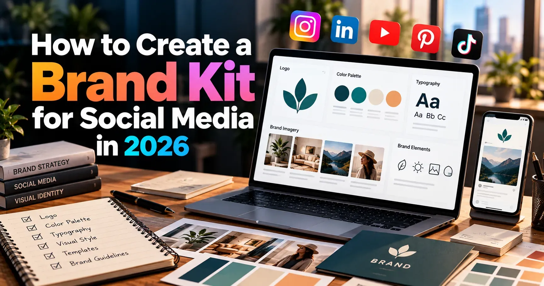
How to Create a Brand Kit for Social Media in 2026
Scroll through any social feed and you will notice something quickly. Some accounts feel instantly familiar. You recognize their colors, their tone, and their style before you even read the name. Other accounts look different every week, and you forget them as fast as you scroll past them. The difference is almost never talent or budget. It is a brand kit.
A brand kit is a simple collection of rules and assets that keeps every post, story, reel, and profile looking and sounding like it comes from the same brand. In 2026, when people see hundreds of posts a day and AI tools can produce content in seconds, consistency is one of the few things that still makes a brand stand out. This guide shows you how to create a brand kit for social media step by step, even if you have never worked with a designer.
Whether you are a solo creator, a small business owner, or a marketer managing several accounts, you will leave with a clear plan, a checklist, and the confidence to build a kit that saves time and makes your content easier to remember.
What Is a Social Media Brand Kit?
A social media brand kit is a organized set of visual and verbal guidelines that define how your brand appears online. Think of it as a small instruction manual for your content. Anyone who opens it, whether it is you, a teammate, a freelancer, or a new hire, should be able to create a post that looks and feels right without asking questions.
A complete kit usually includes:
- Your logo in several versions and formats.
- Your color palette with exact color codes.
- Your fonts and rules for using them.
- Your photo, video, and illustration style.
- Your brand voice and tone guidelines.
- Ready to use templates for common post types.
- Platform specific sizes and profile setups.
Some people confuse a brand kit with a full brand book. A full brand book can run to fifty pages and cover packaging, print, and office signs. A social media brand kit is lighter and more practical. It focuses only on what you need to publish great content every day.
Why You Need a Brand Kit in 2026
Social media has changed a lot in the last few years. Feeds are faster, attention spans are shorter, and audiences are more selective about who they follow. Here is why a brand kit matters more than ever.
Recognition Happens in Seconds
People decide whether to pause on a post in less than a second. A consistent color palette, font, and layout helps your content get recognized instantly, even before the caption is read. Repeated exposure builds familiarity, and familiarity builds trust.
AI Makes Sameness a Real Risk
AI tools can create graphics, captions, and videos very quickly, which means more brands are publishing more content that looks alike. A strong brand kit gives you a distinct visual and verbal identity that generic tools cannot copy. It also gives you clear instructions to feed into any tool so the results stay on brand.
Teams and Freelancers Need Clear Rules
When several people create content, small differences add up. One person uses a different blue, another writes in a formal tone, and a third stretches the logo. A brand kit removes guesswork and reduces the number of revisions.
It Saves Time and Money
Once your templates and rules are ready, creating a new post takes minutes instead of hours. You stop making the same design decisions again and again. Over a year, that saved time is significant.
It Builds Credibility
A polished, consistent profile signals that your business is professional and reliable. New visitors often judge a brand by its social presence before they visit the website, so first impressions matter.
Step 1: Define Your Brand Foundation
Before you pick a single color or font, you need to know who you are and who you are talking to. Design choices should come from strategy, not from what looks trendy this month.
Clarify Your Mission and Values
Write one or two sentences that explain why your brand exists and what you stand for. For example, "We help busy families cook healthy meals in twenty minutes." Then list three to five values, such as honesty, creativity, or sustainability. These values will guide your tone and your content choices later.
Know Your Audience
Describe the people you want to reach. Think about their age, interests, problems, and the platforms they use most. A brand speaking to college students on TikTok will look and sound very different from one speaking to finance managers on LinkedIn.
Choose Your Personality Traits
Pick three to five words that describe how your brand feels, such as friendly, bold, calm, expert, or playful. These words will shape your colors, fonts, images, and writing style. If a design choice does not match your personality words, it probably does not belong.
Write a Positioning Statement
Summarize what you offer, who it is for, and why it is different. Keep it short. This statement keeps your content focused when you feel tempted to chase every trend.
Step 2: Build Your Logo System
Your logo appears on profile pictures, watermarks, thumbnails, and templates, so it needs to work in many shapes and sizes. Instead of one logo file, prepare a small system.
Primary Logo
This is your main logo, usually the full version with the brand name and any symbol. Use it on wide spaces such as cover images and website links.
Secondary or Stacked Logo
Create a version that stacks the name and symbol vertically or in a more compact layout. It helps when a horizontal logo does not fit.
Icon or Monogram
Social platforms crop profile pictures into circles or rounded squares, so you need a simple icon that stays clear at a very small size. A single letter or a simplified symbol usually works best.
Color Variations
Prepare full color, all white, and all black versions. You will need them for dark backgrounds, light backgrounds, and photo overlays.
Clear Space and Minimum Size Rules
Set a rule for how much empty space must surround the logo and how small it can appear before it becomes unreadable. A simple guideline, such as leaving space equal to the height of one letter, keeps things clean.
Logo Misuse Examples
List what not to do. Do not stretch it, do not change its colors, do not add shadows, and do not place it on busy backgrounds. A short list of examples saves you from many mistakes.
Step 3: Choose Your Color Palette
Color is the fastest way to make your brand recognizable. Research often shows that color can strongly influence how people perceive a brand, so choose with care.
Start With Primary Colors
Pick one or two main colors that appear most often in your content. These should reflect your personality words. Blue often feels trustworthy, green feels natural and fresh, orange feels energetic, and black feels premium.
Add Secondary and Accent Colors
Choose two or three supporting colors for backgrounds, highlights, and buttons. An accent color should be used sparingly so it draws attention to important elements such as calls to action.
Include Neutral Colors
Every palette needs neutrals such as white, off white, light gray, and dark gray or black for text. Neutrals give your design room to breathe and keep the layout readable.
Record Exact Color Codes
Write down the HEX code for each color, and also the RGB and CMYK values if you ever print materials. Using exact codes prevents slight shade differences between posts.
Check Accessibility
Make sure text has enough contrast against its background so everyone can read it, including people with vision difficulties. Free contrast checkers can test your color pairs in seconds. In 2026, accessible design is not just a courtesy. It is a mark of a thoughtful brand and it improves readability for all viewers.
Explain How to Use Each Color
Add simple rules such as "use the main color for headlines, the accent color for buttons, and neutrals for backgrounds." Clear rules make your kit truly useful.
Step 4: Select Your Typography
Fonts carry personality just like colors do. A rounded, friendly font feels very different from a sharp, formal one.
Choose Two Fonts at Most
Use one font for headlines and one for body text. Some brands add a third for special accents, but more than that creates a messy look. Pairing a bold headline font with a clean, simple body font is a safe and effective approach.
Prioritize Readability on Mobile
Most social media viewing happens on phones. Choose fonts that stay clear at small sizes and avoid very thin or decorative styles for long text.
Set Size and Style Rules
Note your preferred sizes for headlines, subheadings, and captions on graphics. Also decide rules for capital letters, bold text, and line spacing. For example, you might use all caps only for short labels.
Confirm You Have the Right License
Some fonts are free for personal use but need a paid license for business. Check the license before you build your brand around a font. Many free libraries offer high quality fonts that are safe for commercial use.
Step 5: Define Your Visual Style for Photos, Video, and Graphics
Colors and fonts are only part of your look. The style of your images and videos plays a huge role in how your feed feels.
Photography Style
Decide whether your photos are bright and airy, dark and moody, natural and candid, or clean and polished. Describe the lighting, the backgrounds, and the type of subjects. Include a few example images so anyone can see what you mean.
Video Style
Short form video is central to social media in 2026, so give it clear guidelines. Cover pacing, framing, text overlays, caption style, and how videos begin and end. A consistent opening or closing frame helps viewers recognize your reels and shorts quickly.
Illustrations, Icons, and Shapes
If you use illustrations or icons, choose one style, such as flat, line based, or hand drawn, and stick with it. Also define shapes you use often, such as rounded corners or circles, because they add a subtle but powerful layer of consistency.
Filters and Editing Rules
Decide whether you use a specific filter, preset, or color grade. A consistent edit makes different photos look like they belong together.
Real People and Representation
State how you show customers, team members, and community members. Authentic images usually perform better than stiff stock photos, and they help audiences feel connected to your brand.
Step 6: Write Your Brand Voice and Tone Guide
Your words matter as much as your visuals. A brand voice guide keeps your captions, replies, and comments sounding like one person, even when many people write them.
Describe Your Voice
Use your personality words to explain how you sound. For example, "We are friendly and confident, we explain things simply, and we never talk down to our audience." Add examples of what to say and what to avoid.
Explain How Tone Changes
Your voice stays the same, but your tone can shift depending on the situation. You might be playful in a product launch post, calm and helpful in a support reply, and serious when addressing a problem. Describe these shifts so your team knows how to adapt.
Set Language Rules
Decide how you use emojis, hashtags, slang, and humor. Note words you love to use and words you avoid. Also decide on details such as spelling style, punctuation preferences, and how you address your audience.
Create Caption and Hashtag Guidelines
Explain how long captions should be, how you open them, how you close them, and how many hashtags you use. Keep a short list of branded hashtags and approved campaign tags.
Add Sample Phrases
Include a few ready made greetings, calls to action, and sign offs. Real examples are much easier to follow than abstract rules.
Step 7: Build Reusable Templates
Templates are where your brand kit turns into daily time savings. They also protect consistency, because each new post begins from an approved layout.
Create Templates for Your Most Common Posts
Look at the content you publish most often and build templates for it. Common examples include quote posts, tips, announcements, carousels, testimonials, product features, behind the scenes stories, and reel covers.
Design Story and Highlight Covers
Story templates and highlight icons give your profile a polished, organized look. Use your brand colors and icons so visitors immediately understand the categories.
Prepare Carousel Layouts
Carousels remain one of the most engaging formats. Build a cover slide, a content slide, and a closing slide with a call to action. Keep your fonts and colors the same throughout so swiping feels smooth.
Keep Templates Flexible
Templates should guide, not trap. Leave enough freedom for different images and text lengths so your feed does not feel repetitive.
Name and Organize Your Files
Use clear names such as "Instagram Carousel Cover" or "LinkedIn Quote Post." A tidy library helps everyone find what they need quickly.
Step 8: Add Platform Specific Guidelines
Each platform has its own audience, sizes, and culture. Your brand kit should explain how your identity adapts to each one without losing consistency.
List Sizes and Formats
Record the recommended dimensions for profile pictures, cover images, feed posts, stories, and video. Platforms update these from time to time, so check them a few times a year.
Standardize Your Profiles
Use the same profile picture, handle style, and bio structure across platforms whenever possible. This makes it easy for people to find you and confirms that your accounts are official.
Adjust Tone for Each Platform
Your voice on LinkedIn may be more professional than on TikTok, and that is fine as long as the core personality stays the same. Note these differences in your guide.
Set Posting and Engagement Guidelines
Add notes about how often you post, how quickly you reply to comments, and how you handle feedback. Clear standards keep your community management steady.
Step 9: Include Motion, Sound, and Interactive Elements
Video and audio are now a major part of social media branding, so a modern kit should go beyond static images.
Motion Rules
Describe how text appears on screen, how transitions look, and how fast animations move. Simple, consistent motion makes videos feel more professional.
Music and Sound
Choose a style of music or a small library of approved tracks that match your personality. If you use a signature sound or voiceover style, describe it. Make sure you have the right to use any audio you publish.
Captions and Subtitles
Many viewers watch without sound, so captions are essential. Set a style for caption fonts, colors, and placement so they match your brand and remain easy to read.
Interactive Features
Polls, quizzes, stickers, and question boxes are useful for engagement. Note which ones you use and how they should look and sound in your brand.
Step 10: Set Rules for Using AI Tools
AI is now part of many content workflows, so your brand kit should say how it can and cannot be used.
Decide Where AI Helps
You might allow AI for brainstorming ideas, drafting captions, resizing images, or creating first versions of designs. Be clear about which tasks a human must review.
Protect Your Brand Voice
Include your voice guide and a few sample posts in any prompt you give to an AI tool. This helps the output sound like you instead of sounding generic. Always edit the result so it feels human and accurate.
Be Transparent and Careful
Follow platform rules about labeling AI generated content, and double check facts, names, and claims. Avoid using AI images of real customers or fake testimonials, since honesty is central to trust.
Step 11: Organize, Share, and Maintain Your Brand Kit
A brand kit only works if people can find it and use it. Put everything in one easy to reach place.
Choose the Right Format
Many brands build their kit inside a design tool, a shared folder, or a simple online document. Pick a format that your team can open easily on any device. Include download links for logos, fonts, and templates so nobody has to search.
Keep It Short and Visual
Long documents get ignored. Use clear headings, short explanations, and plenty of examples. A ten to fifteen page kit with strong visuals is often more useful than a huge manual.
Share It With Everyone Who Creates Content
Send the kit to team members, freelancers, agencies, and partners. Walk them through it briefly so they understand the purpose behind the rules.
Review and Update Regularly
Brands grow, and trends change. Review your kit at least once or twice a year. Update colors, templates, and platform sizes when needed, but avoid changing the core identity too often, since consistency builds recognition.
Helpful Tools for Building Your Brand Kit
You do not need expensive software to create a professional kit. Several beginner friendly tools make the process simple:
- Canva, which offers a brand kit feature for storing logos, colors, and fonts, along with easy template creation.
- Figma, which is great for design systems and team collaboration.
- Adobe Express or Adobe Creative Cloud, which are useful for advanced design and editing.
- Color palette generators, which help you find harmonious color combinations.
- Contrast checkers, which test whether your text is readable.
- Shared cloud folders and project boards, which keep files organized and accessible.
Choose the tools that match your skill level and budget. The best tool is the one you and your team will actually use.
Common Brand Kit Mistakes to Avoid
- Choosing colors and fonts because they are trendy instead of because they fit your brand personality.
- Using too many colors or fonts, which makes the feed look chaotic.
- Creating a beautiful kit that nobody can find or understand.
- Forgetting to include voice and tone, and focusing only on visuals.
- Skipping accessibility checks, which makes content hard to read.
- Making templates so rigid that every post looks identical and boring.
- Never updating the kit, so it slowly becomes outdated.
- Ignoring platform differences and using one size for everything.
Your Social Media Brand Kit Checklist
Use this quick checklist to confirm your kit is complete:
- Mission, values, audience, and personality words are written down.
- Primary logo, stacked logo, icon, and color versions are ready.
- Color palette includes exact codes and usage rules.
- Headline and body fonts are chosen and licensed.
- Photo, video, and graphic styles are described with examples.
- Voice, tone, and language rules are documented.
- Templates exist for posts, stories, carousels, and covers.
- Platform sizes and profile standards are listed.
- Motion, audio, and caption rules are included.
- Guidelines for AI tools are added.
- The kit is stored in a shared place and reviewed regularly.
A Simple Plan to Finish Your Kit This Week
If the process feels big, break it into small tasks. On the first day, write your mission, audience, and personality words. On the second day, finalize your logo versions and color palette. On the third day, choose fonts and define your photo and video style. On the fourth day, write your voice guide and sample captions. On the fifth day, build your first five templates. On the sixth day, organize everything in one shared location. On the seventh day, test the kit by creating a week of posts and note anything that feels unclear.
Testing is important. When you use your kit in real life, you will quickly see what needs improvement. Treat the first version as a working draft, not a final masterpiece.
Final Thoughts
A strong brand kit is one of the most valuable assets you can build for social media in 2026. It brings clarity to your identity, saves time on every post, and helps your audience recognize and trust you. It also keeps your content consistent when AI tools, new platforms, and changing trends make it easy to lose direction.
Start with your brand foundation, build your visual and verbal identity, create templates, and keep everything organized and up to date. You do not need to be a designer or have a big budget. You only need clear decisions and the discipline to follow them. Begin today, and within a few weeks your feed will look sharper, your workflow will feel easier, and your brand will be far easier to remember.