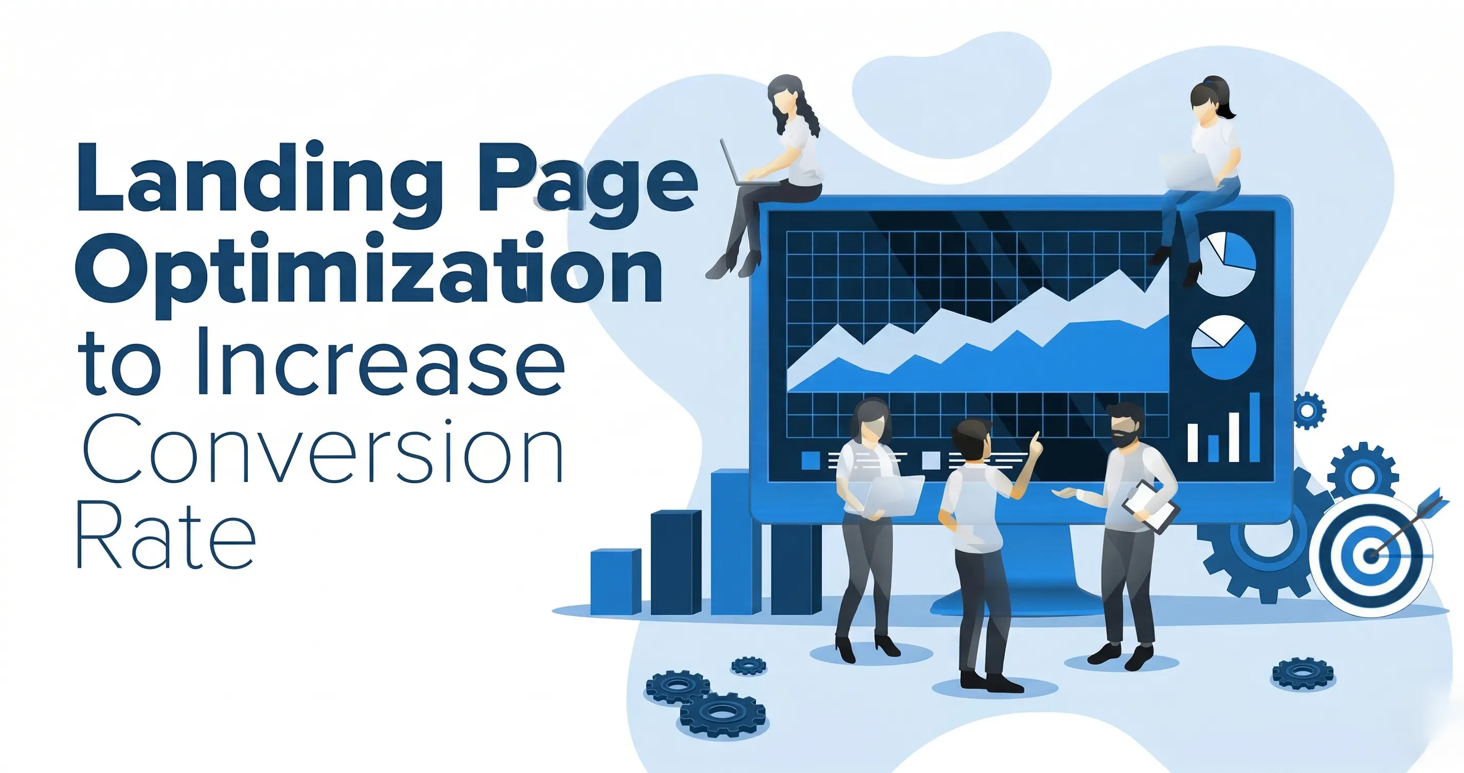
Landing Page Optimisation: 10 Changes That Boost Conversions
Introduction
Most businesses focus almost entirely on driving more traffic to their landing pages. More ad spend, more SEO effort, more social posts. What they overlook is that the page itself is leaking money on every visit.
Across an analysis of more than 41,000 landing pages and 464 million visits, the median landing page conversion rate sits at just 6.6 percent. The top 10 percent of performers, however, convert at rates above 11.45 percent. That gap does not happen by accident. It is the result of deliberate, systematic optimisation applied to every element of the page, from the headline and the hero image down to the number of fields in a form. ALM Corp
The math is straightforward. If your page currently converts 200 visitors out of every 1,000, and you improve that to 300 without changing your traffic, you have grown your leads by 50 percent for zero additional acquisition cost. Conversion Rate Optimisation tools deliver an average ROI of 223 percent. That means every dollar invested in improving your landing pages returns more than two additional dollars on average. ALM Corp
This guide covers ten specific, evidence-backed changes that consistently move conversion rates in the right direction. Every change is explained with the data behind it and the practical steps to implement it.
Change 1: Rewrite Your Headline Around One Clear Benefit
Your headline is the most important element on the page. Every other optimisation effort is undermined if the headline fails to communicate what is in it for the visitor within five seconds.
Your headline should answer the visitor's question of what is in it for me within five seconds. If someone unfamiliar with your product cannot explain your offer after reading your headline, you have clarity problems that no amount of traffic will solve. Lovable
The most common headline mistake is describing the product rather than the outcome the visitor will experience. "Our award-winning project management software" tells the visitor about you. "Ship projects on time, every time, without the chaos" tells the visitor what their life looks like after using you. The second version converts better because it connects to the visitor's motivation.
Headline optimisation delivers a 27 to 104 percent conversion lift. Both require minimal technical complexity and can be implemented in hours rather than weeks. Lovable
The formula that works most consistently is: specific outcome plus relevant timeframe plus removal of the main objection. For example: "Generate qualified leads from LinkedIn in 30 days, no technical setup required." Test at least three headline variants before settling on one, and use real language your customers use rather than marketing terminology your team invented.
Change 2: Remove Navigation Links From the Page
This is one of the most counterintuitive changes and also one of the most consistently impactful.
Tests show that removing navigation links can boost conversions by around 100 percent, effectively doubling them. Fewer ways to click away means more focus on the CTA. If your landing pages still display your website's usual header menu, try hiding it and see if conversions improve. involve.me
Landing pages exist to accomplish one objective. Every navigation link is an escape route that takes the visitor away from that objective. When you give someone ten directions to follow simultaneously, they often follow none of them. Remove your top navigation, footer navigation, and any internal links that do not directly support the conversion action. Keep only the essential information and the call to action.
The only exception worth considering is a link to your privacy policy or terms of service, which can actually support conversions for visitors who need reassurance before submitting personal information. Everything else should go.
Change 3: Reduce Form Fields to the Absolute Minimum
Long forms are the single largest conversion killer on most landing pages. Every additional field you require creates psychological friction and gives the visitor another reason to stop.
Form length reduction delivers the highest conversion lift at 120 percent according to data from thousands of A/B tests. Both require minimal technical complexity and can be implemented in hours rather than weeks. The goal is to make the initial conversion as effortless as possible by asking only for the absolute minimum information required to start a conversation, typically just an email address. Lovable
The solution for teams that need more data over time is a strategy called progressive profiling, where you gather information in stages throughout the customer lifecycle. HubSpot championed this approach by using smart forms that recognise returning visitors and present them with new fields to collect more data over time. Uforocks
For most lead generation pages, start with one field: email address. For higher-commitment offers, first name and email is enough. For B2B pages where company size matters for qualification, add company name as a third field. Resist the temptation to collect everything upfront. Your sales team can gather the rest of the information during follow-up.
Change 4: Rewrite Your CTA Button Copy
Most calls to action are still using generic text that creates zero motivation. Submit. Sign Up. Click Here. Get Started. These phrases describe an action without communicating any value. They make the conversion feel like work rather than a reward.
Case studies show that changing a single CTA from Sign Up for Free to Trial for Free resulted in a 104 percent increase in trial start rate. Sign Up implies ongoing commitment, while Trial implies temporary evaluation with a defined endpoint. This subtle word choice reframes the action as exploratory rather than permanent, lowering psychological barriers to conversion. Lovable
The principle behind this is that your CTA copy should complete the sentence "I want to..." from the visitor's perspective. "I want to Download the Free Guide" is more motivating than "I want to Submit." "I want to See My Results" is more compelling than "I want to Sign Up."
Testing different CTA button colours, text, size, or placement is the top priority for A/B testing on landing pages. Since the CTA is the gateway to conversion, optimising it can have outsized impact. Ensure your CTA stands out visually and uses compelling text that completes the phrase "I want to" rather than a bland Submit. involve.me
For colour, ensure your CTA button has strong visual contrast against the page background so it is impossible to miss. The colour itself matters less than the contrast. Run one CTA copy test per month and document what you learn.
Change 5: Optimise Page Speed Aggressively
Every second of load time is costing you conversions. This is not a theoretical risk. It is a documented financial reality.
Page speed improvements of 0.1 seconds increase conversions by 8 to 10 percent. Additionally, 53 percent of mobile users abandon sites that take longer than 3 seconds to load. The fastest fixes are: compress images using TinyPNG which delivers a 20 to 40 percent load time reduction, use a CDN like Cloudflare's free tier which delivers a 30 to 50 percent improvement for global visitors, and enable browser caching which delivers a 30 to 50 percent improvement for returning visitors. These three fixes require minimal technical knowledge and deliver substantial improvements on most sites. Lovable
Amazon famously calculated that every 100 milliseconds of latency costs them 1 percent in sales. Similarly, when Walmart optimised its mobile pages to load in under one second, they saw a sharp increase in conversions. Google's own Core Web Vitals initiative has made page experience a key ranking factor, underscoring the importance of technical excellence not just for user experience but also for organic visibility. Uforocks
Use Google's PageSpeed Insights tool to generate a specific list of speed issues on your current page. Address them in order of impact. For most pages, image compression alone provides the largest single improvement and takes less than an hour to implement.
Change 6: Place Social Proof at the Right Moments
Most landing pages treat social proof as decoration: a testimonials section buried halfway down the page that visitors rarely reach. This misunderstands how and when proof actually changes conversion behaviour.
Trust is not a single section. It is a sequence of confidence signals distributed across decision points. Users evaluate credibility based on multiple small signals across a page, including transparency, clarity, and consistency, rather than relying on a single proof element. Useful trust elements include contextual outcomes, role-specific proof, process transparency, and expectation clarity for what happens after conversion. Trust density should be balanced. Too little proof increases scepticism. Too much proof can overwhelm and delay action. Placement is more important than volume. Evidence should appear near the claim it validates and near the action it supports. Unicorn Platform
In practice, this means placing a brief testimonial immediately below your headline, near the CTA button, and next to any form. These are the moments of highest doubt. A single specific testimonial from a recognisable company that mentions a concrete result is worth more than ten generic five-star ratings.
Enhance credibility by featuring case studies, logos, or testimonials from companies within the target segment. A testimonial from a similar company is far more persuasive than a generic one. Uforocks
Specificity is everything in social proof. "Great product, highly recommend" is nearly worthless. "We reduced our customer acquisition cost by 34 percent in the first 60 days" is highly persuasive. Always edit testimonials to lead with the specific outcome.
Change 7: Optimise the Above-the-Fold Section
The above-the-fold section, meaning everything visible without scrolling, is where the vast majority of your conversion decisions are made. Most visitors decide within seconds whether to stay or leave based solely on what they see first.
In the visible area without scrolling, include your headline, subheadline, a compelling visual, and a clear CTA. This section drives the majority of conversions. Brandedagency
Your subheadline should answer the follow-up question your headline naturally raises. If your headline says "Hire vetted developers in 48 hours," your subheadline should answer "How is that possible?" or "What makes these developers different?" The combination of headline plus subheadline should give a visitor enough information to understand your offer without scrolling.
The visual in your above-the-fold section should reinforce the offer. Product screenshots for SaaS tools, before and after images for transformation-based offers, and human faces that reflect your target audience all consistently outperform abstract graphics or stock photography that bears no direct relationship to the offer.
Conduct a five-second test on your above-the-fold section: show it to someone who has not seen your page before and ask them to explain what you offer. If they cannot do it, your clarity problem starts at the top.
Change 8: Make the Page Fully Mobile-Optimised
Mobile is no longer a secondary consideration. It is the primary context in which many of your visitors will encounter your landing page.
Seventy percent of shoppers prefer to buy through smartphones, making mobile-optimised landing page design essential for e-commerce success. Short-form interactive videos boost sales and conversions by up to 80 percent. These formats build trust in your brand quickly. Hostinger
Mobile optimisation goes beyond making the page responsive. It means rethinking the layout, content hierarchy, and interaction design specifically for a small touchscreen experience. Mobile visitors are typically in a different mindset than desktop visitors: they have less patience for long copy, higher expectations for speed, and very different physical interaction constraints.
If your landing page is not optimised for mobile devices, you risk losing a significant number of potential customers. Make sure your content is easy to read, your buttons are easy to click, and your layout adjusts properly on smaller screens. Creatorstudio99
Specific mobile optimisations to check: ensure all CTA buttons are at least 44 pixels in height so they can be tapped without frustration. Make sure form fields expand to full width on mobile and the keyboard does not obscure the submit button. Check that all images scale properly without horizontal scrolling. Remove any pop-ups or interstitials that are difficult to close on a small screen. Test the page personally on a real mobile device, not just a browser emulator.
Change 9: Use Video to Accelerate Trust and Understanding
For offers that are complex, unfamiliar, or high-value, video can compress the trust-building timeline dramatically.
Videos influence 82 percent of consumers to make purchases. Video content can be especially powerful during the decision-making phase to engage, inform, and persuade shoppers. Short-form interactive videos boost sales and conversions by up to 80 percent. Hostinger
The most effective landing page videos are not polished brand advertisements. They are demonstration videos that show the product working, explainer videos that make a complex offer immediately understandable, or founder and customer story videos that build personal connection and credibility.
Keep the video between 60 and 90 seconds for most landing pages. Lead with the biggest benefit in the first five seconds because many visitors will not watch further unless you earn that attention immediately. Include captions because many mobile users watch without sound. And critically, do not autoplay with sound, which is one of the most reliable ways to trigger an immediate page exit.
Autoplay on mute can work because it draws the eye and communicates movement and energy. But give visitors the choice to activate sound rather than forcing it on them.
Change 10: Run Systematic A/B Tests and Document Every Result
All nine changes above are based on data from large-scale studies. But your specific audience, your specific offer, and your specific traffic source may respond differently than the average. The only way to know what works for you is to test.
A/B testing is widely used: 77 percent of businesses worldwide report using A/B testing or similar experiments on their websites including landing pages. And specifically, 44 percent of companies use dedicated A/B or multivariate testing software to optimise landing pages. Testing different headlines, images, or layouts is now a standard practice and one of the most effective ways to incrementally improve conversion rates over time. Most tests do not win but keep testing. Only 1 in 8 tests, which is 12 percent, produces a statistically significant improvement in conversion. involve.me
The discipline is in the process rather than the individual test. Run one test at a time so you know which change drove which result. Let tests run until you have statistical significance, which typically means at least 100 conversions per variant. Document every test, including the hypothesis, the result, and what you learned even from tests that did not produce a lift.
Most stalled programmes suffer from test noise. Teams change headline language, layout order, CTA style, and form depth in the same release. Metrics move, but no one can explain which change drove the movement. One major change per release cycle improves attribution quality. Unicorn Platform
If your traffic is below 1,000 weekly visitors, use proven best practices without testing first. Prioritise: reduce form fields, improve headlines, boost CTAs, and add social proof elements, then address page speed. Lovable
The Conversion Optimisation Mindset
Underlying all ten changes is a single principle: every element of your landing page should exist to serve the visitor's decision-making process, not your desire to communicate everything you know about your product.
High-performing conversion pages usually follow one stable sequence: relevance, mechanism, confidence, and action. Relevance tells users whether the page is meant for their situation. Mechanism explains how the offer creates value. Confidence provides evidence and risk clarity. Action gives one clear next step. When this sequence is preserved, teams can test copy and design variations safely. Unicorn Platform
Landing page optimisation is about continuously iterating and testing different strategies based on listening carefully to your audience. What works for other businesses might not work for yours. Expanding your site to include 10 to 15 targeted landing pages can result in over 50 percent more conversions compared to businesses with fewer pages. Hostinger
Start with the changes that have the highest documented impact and the lowest implementation complexity. Based on the data in this guide, that means starting with form field reduction, headline rewriting, and CTA copy testing. These three changes require no design or development work beyond a few text edits and can produce meaningful conversion lifts within days.
Track your baseline conversion rate before making any changes. Then implement one change at a time and measure the impact over at least two weeks before moving to the next. This is slower than making ten changes at once, but it is the only approach that tells you what actually moved the needle.
Conclusion
Most landing pages are leaking conversions. Not because the offer is wrong, but because the page itself is getting in the way. Going from 10 landing pages to 15 alone produces a 55 percent increase in conversions. Google Ads quality scores are tied to landing page experience. A poorly optimised page hurts your ad performance, raises your cost-per-click, and lowers your ad position. Optimising your landing page improves both conversion rates and paid media efficiency simultaneously. ALM Corp
Every improvement you make to your landing page compounds over time. A visitor who arrives next month benefits from every optimisation you make today. The best time to start was when you launched the page. The second-best time is right now.